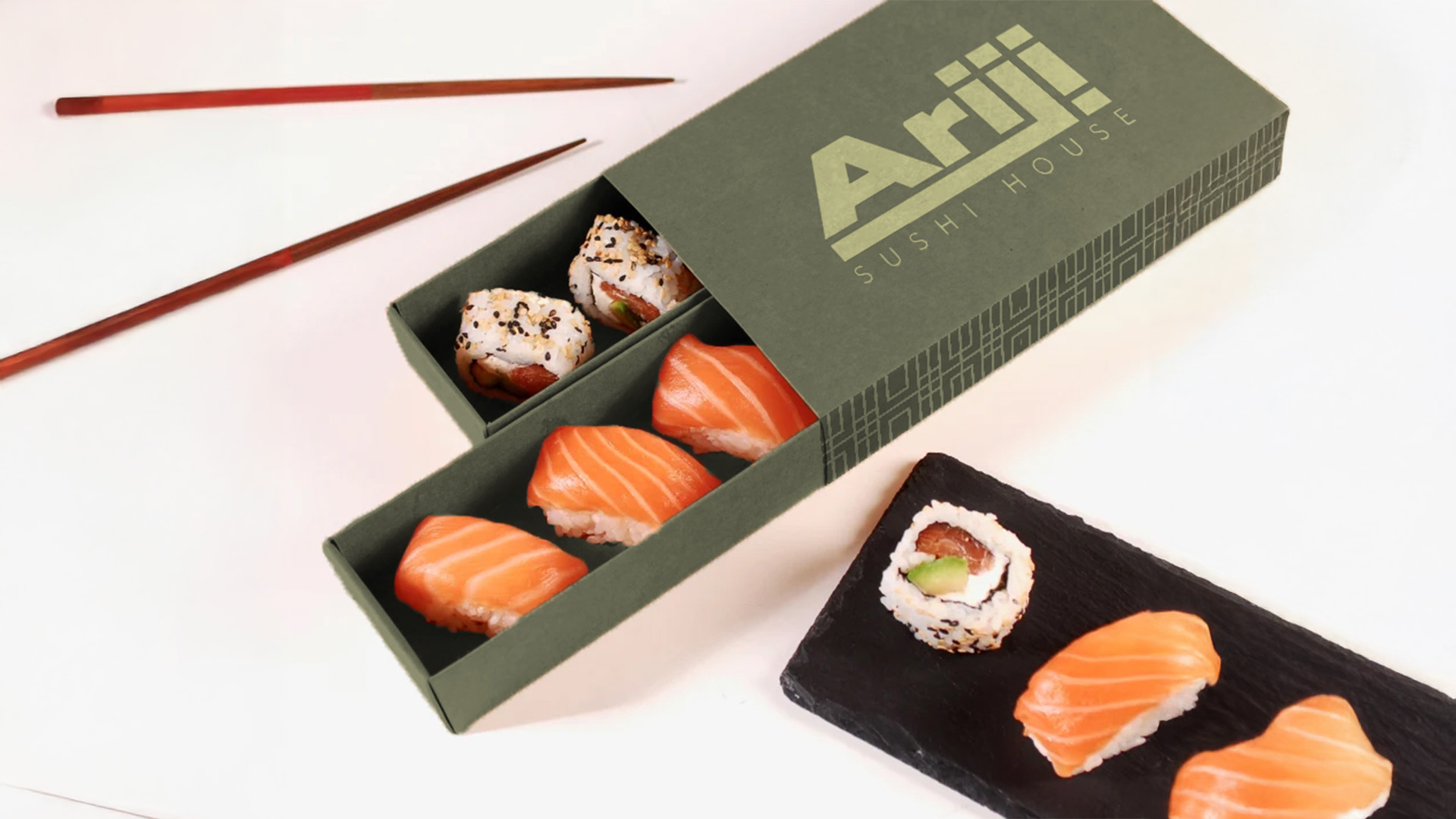
This is Ariji, a trendy Sushi House. The challenge for this sample was to visually demonstrate the experience you would get from dining through its branding. I believe I achieve this through my use of color and typography. Ariji's color palette uses muted greens and oranges. For Ariji, green symbolizes freshness, balance, and energy and orange symbolizes warmth and excitement. All things relating to the experience you would have at this sushi restaurant. Fresh, balanced tasting food, with a warm and welcoming atmosphere. The typography of the logo and menu signifies the restaurant being premium, trendy, and welcoming. The targeted audience for this restaurant is young adults to adults.